Choropleth map
SDG Indicator 13.1.1 Climate action
Number of people whose livelihood were disrupted by disasters
A choropleth map is a thematic map where areas are shaded or pattered in proportion to the value of a variable being represented, such as population density, deforestation rates or incidence of disease. These maps are widely used to visualise how a measurement varies across a geographic area, making complex data more accessible and easier to understand. Choropleth maps often use normalised values to produce a map of densities. In today’s data-driven world, choropleth maps are increasingly relevant, as they improve the communication of spatial patterns and trends, especially in fields such as public health, urban planning, and environmental monitoring.
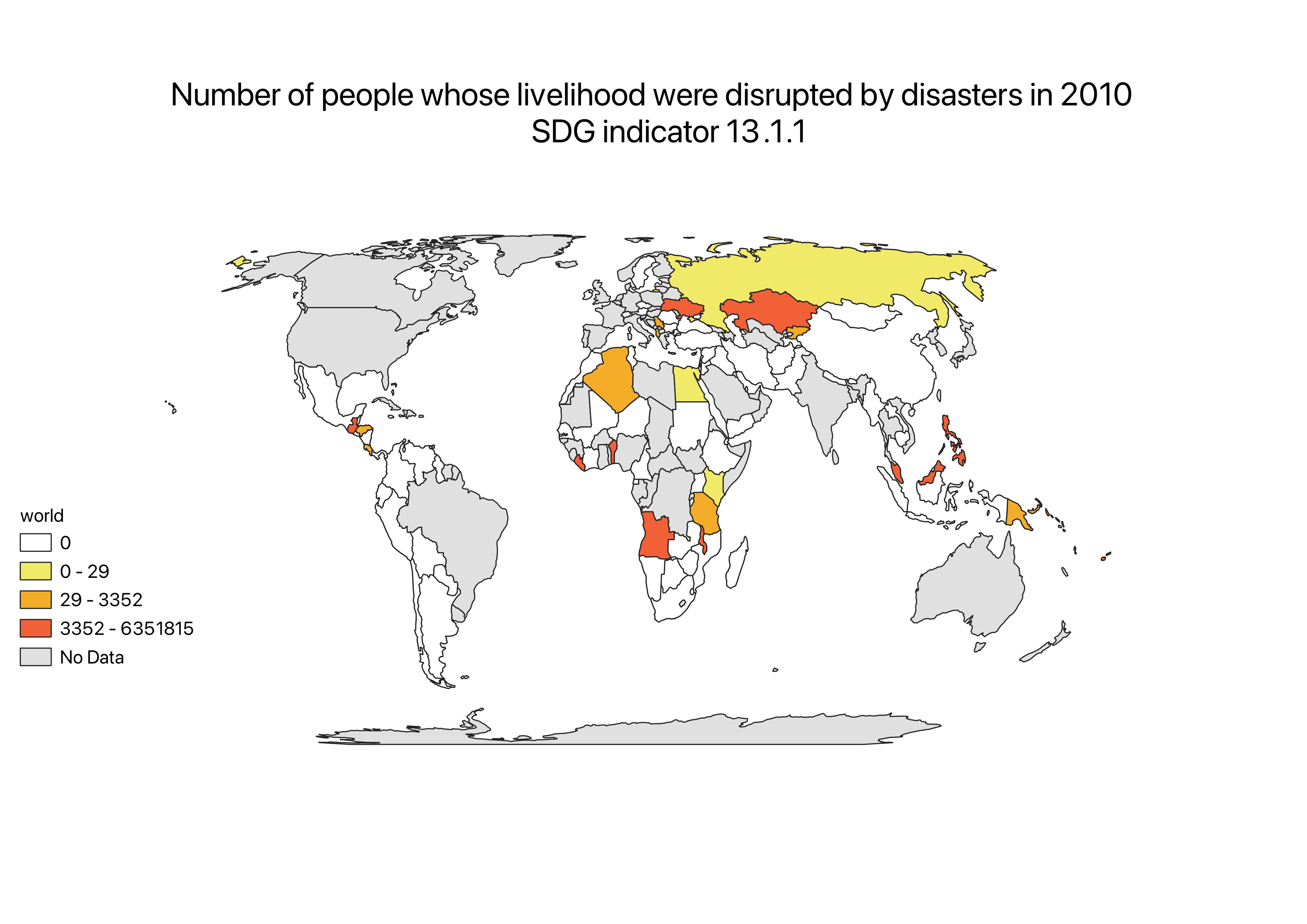
The choropleth map I created illustrates the number of people whose livelihoods were disrupted by disasters, providing a clear visual representation of the impact across different regions. Using a swipe tool in this interactive map via ESRI Online, users can easily compare the severity of livelihood disruption between the years 2010 and 2020. Unexpectedly, this comparative analysis reveals that livelihood disruption was significantly worse in 2010, which-using knowledge from a previous course 'Earth and Environment', can be attributed to the effects of La Niña events. In 2010, La Niña led to extreme weather patterns, including severe droughts and floods, which caused significant livelihood destruction in various parts of the world. These conditions disrupted agriculture, impacted communities, and damaged infrastructure, severely disrupting economies and food security in affected regions. By highlighting these variations over time, the map offers valuable insights into how climate-related disasters affect communities, emphasizing the importance of climate action and resilience planning.
Reflecting on my experience working on an interactive choropleth map, I faced several challenges, particularly with data (in)completion and spatial joining. Uploading the maps made in QGIS into ESRI Online, turned out to be more complex than I was expecting, which was also the case for finding and cleaning data to ensure accuracy and effective usability. For this choropleth map, I used open data from the Sustainable Development Goals (SDGs), specifically focusing on data related to livelihood disruption as a result of disasters under the 'Climate Action' goal. This project broadened my understanding of the practical applications of geospatial data in addressing global challenges and enabled me to acquire new skills in working with QGIS and ESRI Online.